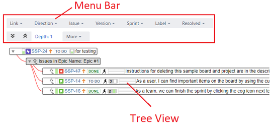
The Tree view is composed by two parts: the menu bar and the tree view area:
The menu bar
...
By default, the first level is automatically loaded and expanded: Depth: 1
The issues are painted with white color for the background and their links children are grouped by link type with gray background color: 
Linked issues are grouped by their link type and direction. Links nodes are painted in gray whereas issues are painted in white.
The tree content
The issues can be expanded and collapsed to show and hide their children:
The issue nodes show the following default JIRA datatree content is dynamic. The users can expand/collapse any node (link or issue) to show/hide it. By default 1 depth level is loaded. However the user can increase the auto-expand value up to 4 levels.
In addition, the users can also apply filters on data to put the focus on the relevant only. These are the filters supported:
- the link direction icon (inward or outward)
- the issue key (with a link to the Issue Detail View on JIRA).
- the issue priority icon
- the issue status (lozenge or icon accordingly with the JIRA version)
- the issue summary text
- the issue work progress bar
- the Agile sprint icon (if Agile is installed)
...